Principle Of Design Poster
Designing an eye‑catching poster is more than picking a bold font and a striking image. It requires a clear understanding of the principles of design that guide the visual narrative and ensure the message is delivered effectively. Whether you’re a student, a freelance designer, or a marketing professional, mastering these principles will help you create posters that communicate, persuade, and inspire.
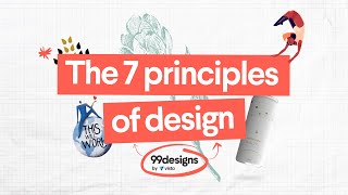
Core Design Principles for Posters
While there are many design elements to consider, the following fundamentals form the backbone of every successful poster:
- Balance – The distribution of visual weight across the canvas.
- Contrast – Differences in color, size, and shape that make elements stand out.
- Alignment – Consistent positioning that creates order.
- Repetition – Reused shapes, colors, or textures that unify the design.
- Proximity – Grouping related items to reduce clutter.
- Hierarchy – A clear order of importance that guides the viewer’s eye.
- Unity – The overall cohesion that makes the poster feel like one piece.
These seven pillars are interrelated; altering one often affects the others. A balanced layout, for instance, supports a strong hierarchy by ensuring that focal points receive the appropriate visual weight.
Visual Hierarchy: The Most Powerful Technique
Visual hierarchy is the art of arranging elements so that the viewer’s eye naturally follows a predetermined path. It is essential for posters because they must convey information quickly, especially in crowded spaces.
- Size & Scale – Larger elements attract attention first.
- Color & Contrast – Bright or saturated colors stand out against muted backgrounds.
- Typography – Font weight and style differentiate headlines, sub‑heads, and body text.
- Placement – Positioning near the top or center often signals importance.
By combining these tactics, designers can guide viewers from the headline, through supporting details, to the call‑to‑action.
Layout & Composition in Graphic Design
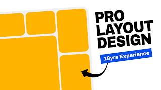
Good layout turns a set of ideas into a coherent visual story. Here are key steps to build a strong composition for a poster:
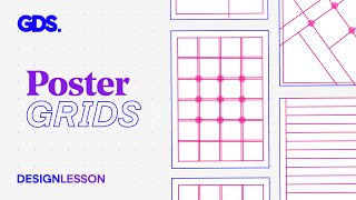
- Define the Grid – A simple grid (columns, rows, or a modular system) provides structure.
- Set the Focal Point – Place the most critical element where the eye lands first.
- Use the Rule of Thirds – Position key elements along the intersecting lines for natural balance.
- Maintain Consistent Spacing – Equal margins and padding create rhythm.
- Consider Negative Space – White or empty space around elements enhances readability.
These techniques are often covered in “crash courses” on layout, but